This project started small: the team was in the midst of implementing a design system, and I was tasked with taking a holistic look at the card interface that we were using to present courses.
After combing through existing qualitative research, we realized that the problem was larger than an inconsistent card interface: our learners were overwhelmed by our catalog and were having trouble choosing courses, leading to lower enrollments.
We decided to take a step back to look at this larger problem, rather than restrict ourselves to the card interface. The new project objective became to reimagine how learners find, understand, evaluate and compare courses that will help them achieve career success.
We realized right away that this needed to be a cross-team initiative, and a partnership between our Growth and Enterprise teams was born. Throughout the entire process, I worked very closely with a designer on the Growth team. We also included members of other teams — both design and cross-functional — in numerous workshops and share outs.
We started off with a thorough audit of the current experience, mapping out the user flows, looking at the quantitative data, and reviewing the large library of existing qualitative research reports. We also gathered input from across Coursera: speaking to our customer-facing teams, reviewing our customer community, and syncing with other product teams.
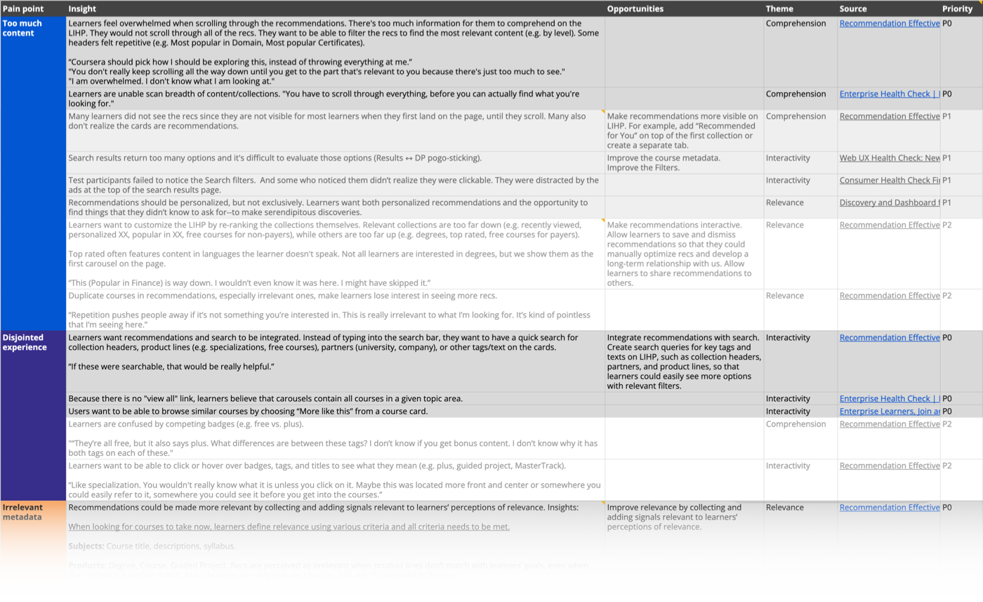
We pulled all of the relevant insights from the qualitative research library, then summarized, grouped, and prioritized them so that they could be used to inform future decisions.
At Coursera, we have a variety of audiences with quite different needs. For example, a learner on the consumer side may want to learn the skills they need to start a new career, a Coursera for Business learner might be more focused on completing the courses their manager has asked them to do so that they can do better at their current job, and a Coursera for Campus learner may want to find courses to supplement their existing curriculum.
Our end goal was to design a flexible discovery framework that would be able to adapt to our different product areas, meeting the needs of our varying audiences. To do this, we needed to understand the differences. We had a few different audience segmentation resources to pull from, and we gathered these together and created a matrix to summarize. This matrix was used in combination with personas to ground workshops.
| Re-skillers | Up-skillers | |
|---|---|---|
| High Specificity (Late in learning journey) |
"I know which skills I need for the job." | "I know which skills I need to advance, and I'm curious about a specific topic." |
| Low Specificity (Early in learning journey) |
"I don't know which skills I need for the job. I try to identify them using job postings, trend articles, how-to reskill articles, Reddit, YouTube, and my network." | "I don't know which skills I need to advance. I try to identify them by speaking to my manager and my peers." |
In a series of cross-team workshops, we used the prioritized insights and audience matrix to align on three key problem statements.
| Problem #1 | As a learner without specific content in mind, I find Coursera's content overwhelming. I don't know where to start and, once I figure out where to start, I can't dig deeper. This is preventing me from finding courses that meet my career needs. |
|---|---|
| Problem #2 | As a learner with specific content in mind, I find it difficult to decide which course fits my preferences because there are so many different options. I don't know how I can narrow down my search to find what I need. This is preventing me from finding courses that meet my intended career outcome. |
| Problem #3 | As a learner, I'm not sure what the information on the course cards means. I think some of it is relevant, but I wish there was more information to help me decide which course I should take. I'm finding it hard to compare courses against one another to find one that fits my goals and lifestyle needs. |
We also did a thorough competitive analysis, looking at both direct competitors and products outside of our space with leading and innovative discovery experiences. In addition to helping us understand where we stand, we were able to pull insights from these experiences.
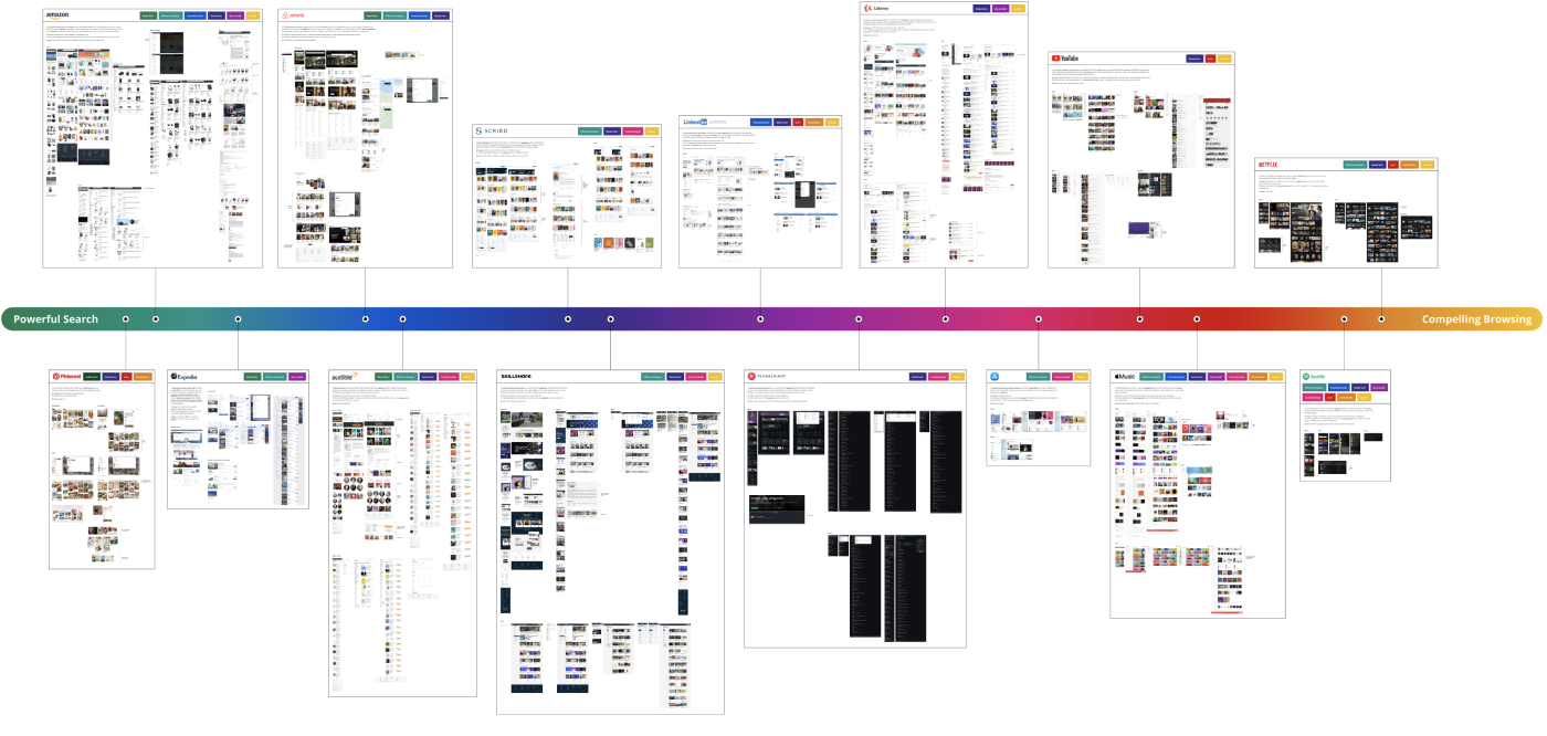
This spectrum plots these other products from powerful search experiences to compelling browse experiences.
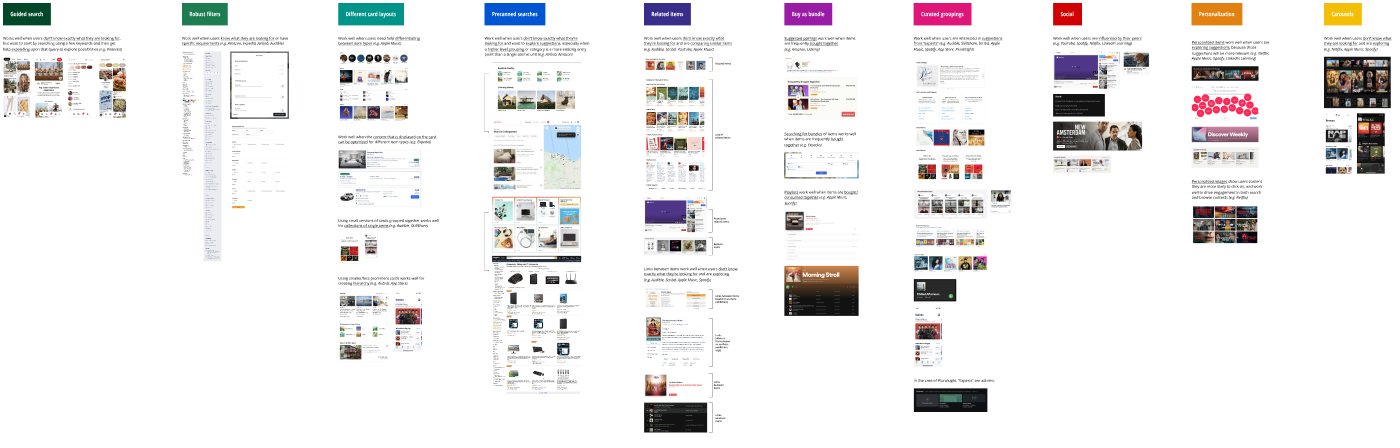
Patterns were identified across the spectrum, and were used to inform ideation workshops.
Now that we had a defined audience and a clear set of problems to solve, we set out to design a solution. In a cross-team workshop, we created a handful of hypotheses — how might we solve the identified problems? We grouped and prioritized these hypotheses, and synthesized them into three distinct concepts. For each concept, we wireframed out the various user flows that our learners would go through to discover relevant content.
This concept focused on being helpful in the decision making process and anticipating career-switchers' needs and motivations.
Hypotheses:
This concept focused on being intuitive and outcome-oriented to empower learners to find the best-fit content.
Hypotheses:
This concept focused on being simple and intentional to help learners feel less overwhelmed.
Hypotheses: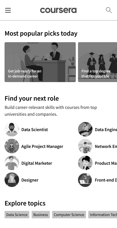
We worked with a user research agency in India to test and validate these three concepts. These are some of the key insights that we gained from the research:
We used these insights to create one refined concept.
Meanwhile, we also started the process of presenting this work to leadership, as well as the larger Coursera team, in order to get the support and resources we would need to see it come to life in the product.
To make the final concept as powerful as possible, we decided to apply visual design to the wireframes. During Coursera’s make-a-thon week, we conducted a design sprint. We used a 20 second gut test and a mood board to align on a visual design direction, then applied this design to the main user flows.
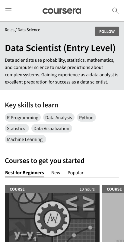
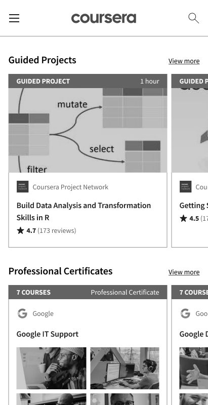
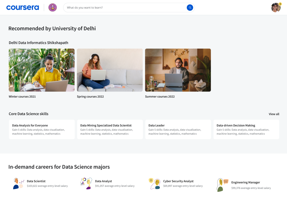
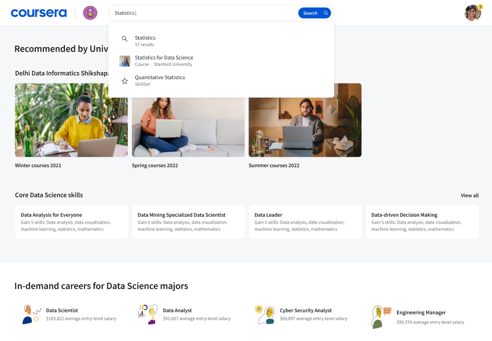
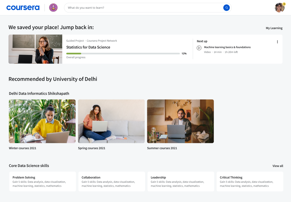
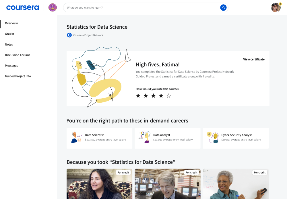
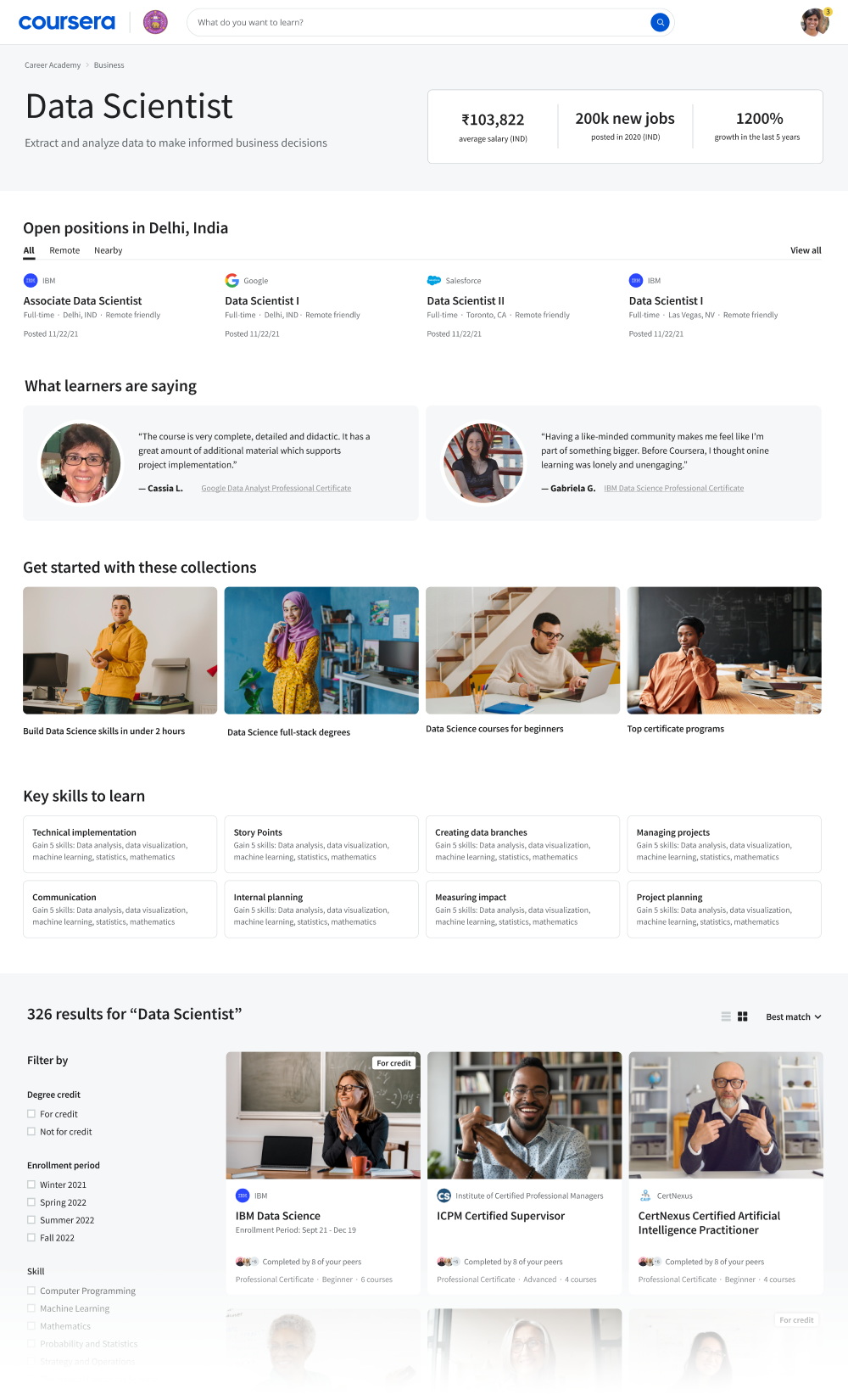
Ultimately, we identified eight user flows, across our various learner types and product areas, that told the full story of Coursera’s product. We created designs for each of these flows. Here's an example of one:
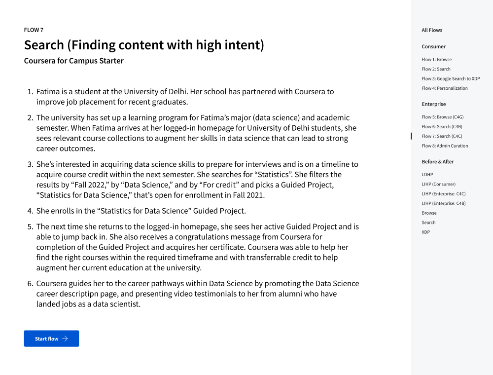
We did a series of roadshow presentations to share these final eight user flows with leadership and various teams across Coursera.
The roadshow presentations created the leadership buy-in that we needed, and a new product pod was created to bring the concept to life in the product.
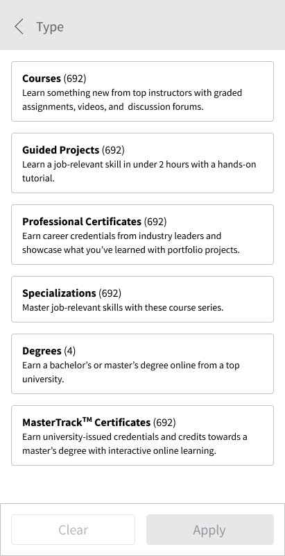
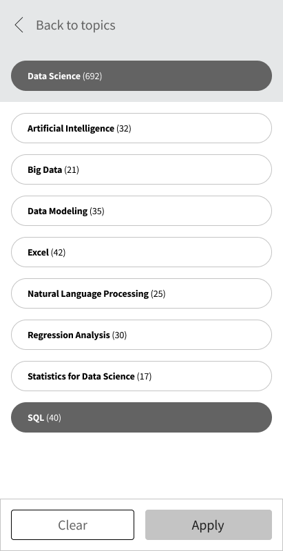
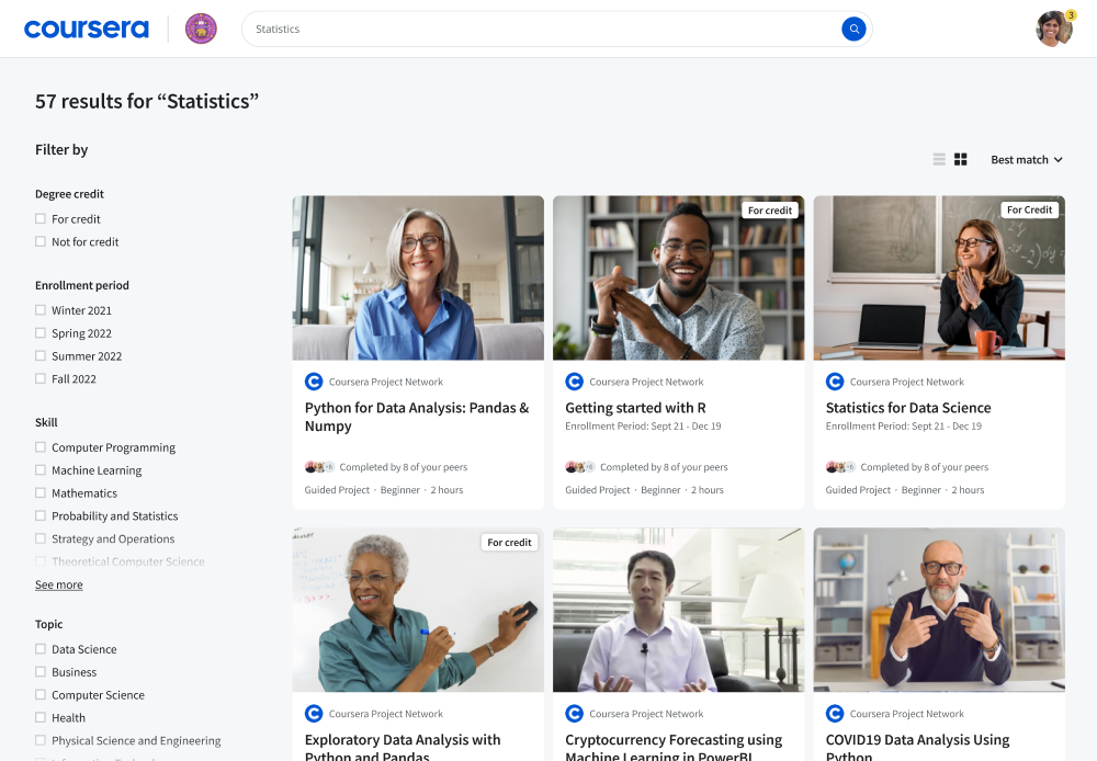
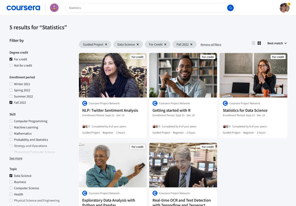
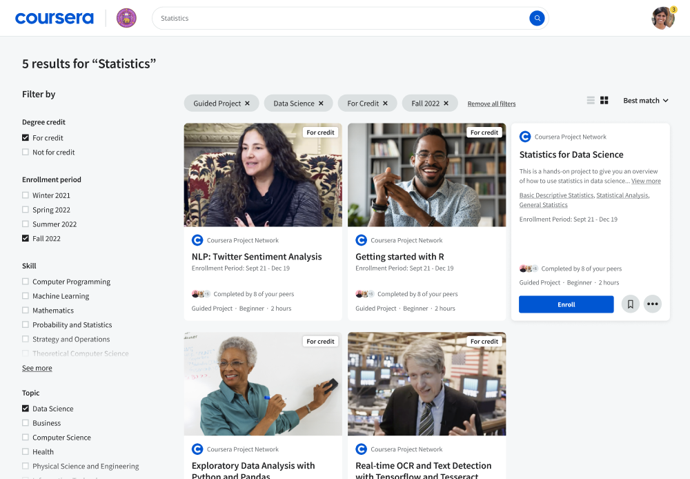
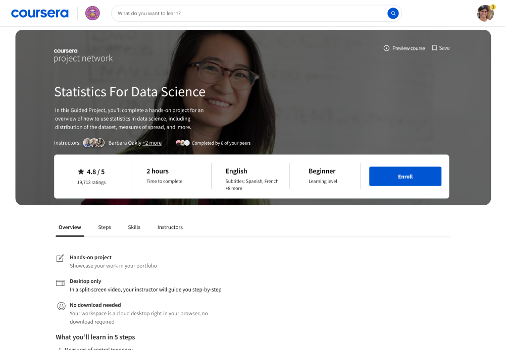
Using the concept as a “North Star,” that pod has started building out specific aspects, one at a time, using a hypotheses-based approach to build and test the impact of each. One of the first tests — new search filters — led to increased engagement with the filters, making it easier for learners to find and compare courses relevant to their career goals.
The final concept was presented at Coursera’s annual conference, which generated a lot of customer excitement. We heard from many customers: “When can we have this?”
Lead Designer