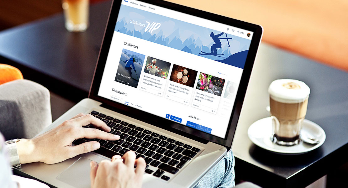
Influitive creates an industry-leading customer marketing platform that mobilizes customers and advocates using content-targeting, gamification, and rewards.
When I started, the focus was on building out community functionality — the goal was to create a community where advocates, prospects, and customers come together. The advocates help drive the community by sharing information and answering questions, leading to prospect conversion and customer retention.
They had a vision, business strategy, and some high-level feature ideas, and needed help bringing it to life.
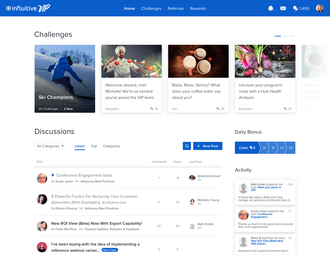
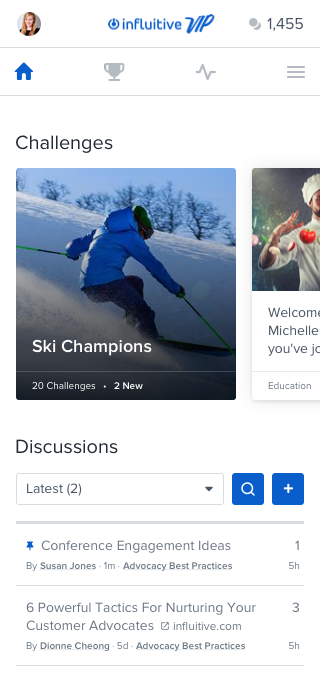
The first goal was to bring discussions to the forefront by revamping the product’s homepage, and the key metric was to drive more discussions engagement without decreasing any other types of engagement.
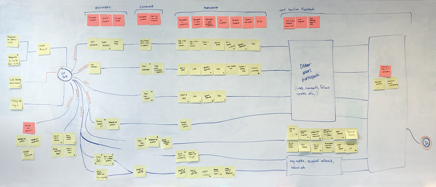
Influitive is a truly customer-powered business that invests a lot into knowing their customers — their businesses, use cases, and how they use the product. However, as is common in B2B, insight into the end users of the product (the customer’s customers) is harder to obtain. To close this gap, one of the first things I did was to survey end users to gain a better understanding of their goals and needs. Based on the results, we defined core use cases and created user flows.
Meanwhile, we did competitor research to gain a better understanding of the community market and where we needed to level up versus where we were already strong.
We then created wireframes for a few different homepage layouts and proceeded to conduct interviews with key customers. Based on their feedback, we narrowed it down to two layouts.
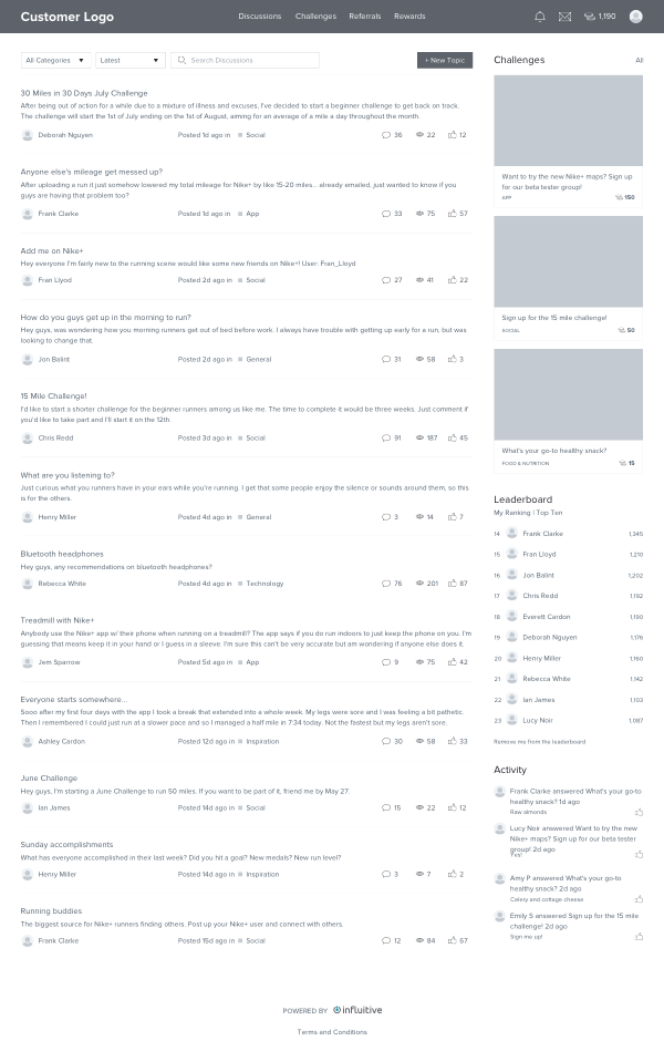
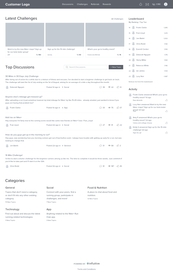
We created designs for both layouts, then built an MVP version so that we could conduct a multivariate test: we compared the first layout (which was focused on showcasing new content and had the challenges along the top), the second layout (which put more prominence on discussions and had challenges on the side), and a control (which had no homepage at all).
After running the test for a few weeks, we were able to conclude that having a homepage led to higher engagement than the control, but the position of challenges had negligible impact on the numbers.
While the multivariate test was running, we also gathered a lot of qualitative feedback. We found that — despite the engagement being equal — people felt a strong aversion to the second layout. Many told us that the challenges along the side reminded them of ads. We also learned, by analyzing trends in the qualitative feedback, that people wanted more challenges and that they felt the discussions looked a bit stale.
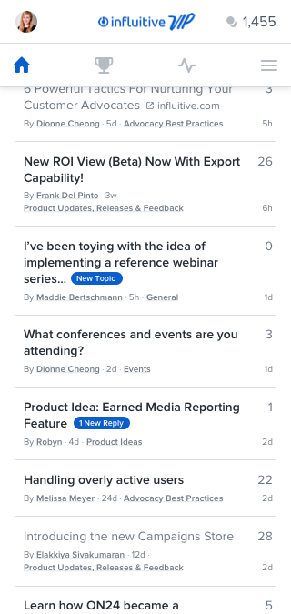
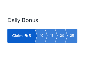
From these insights, we refined the designs: we added a carousel to the challenges area so that customers could choose to feature more challenges and we revised the discussions area to focus more on new content (showing the last post, drawing attention to new content with badges).
To help with development and QA, all of the various states were documented using diagrams.
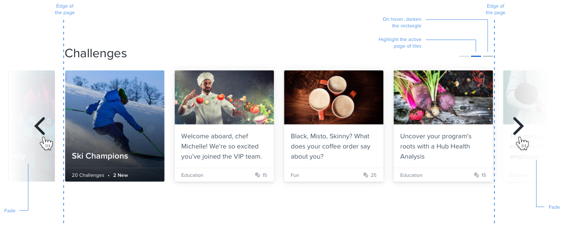
Simple animations were incorporated to add excitement and delight to key interactions.
Since the homepage launched, discussions engagement has been gradually rising, and other engagement has remained steady. We’ve also been continuously iterating on the homepage design. For example, we ran an A/B test on the sorting algorithm for the carousel to ensure that we’re featuring the most relevant content and we redesigned the cards to make the page more modern and visually appealing.
Director of Design